Color Exploration Through Iterative Passes
Why iterate colour
Colour choices shape mood, depth, and legibility. Iterative colour work separates decision-making into manageable tests so you can evaluate hue, temperature, and saturation without overwhelming the image. The approach below treats colour like a sequence of experiments rather than a single leap.
Pass 0: limit and swatch
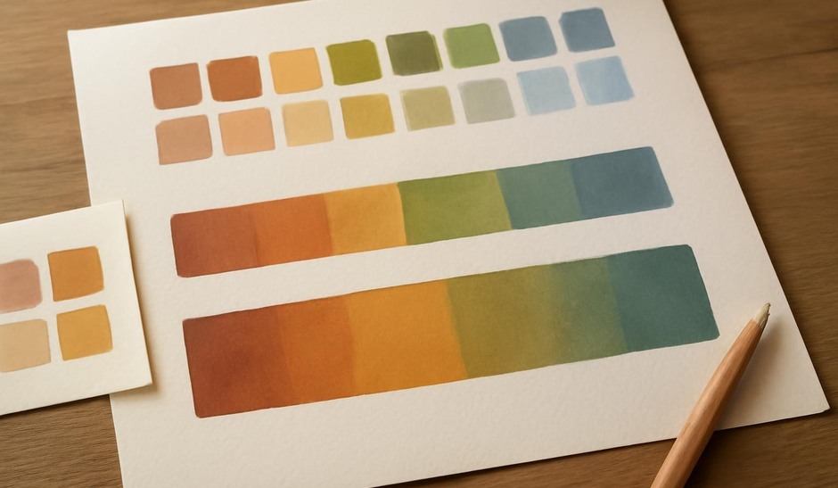
Begin with a constrained swatch test. Choose three to five colours that feel relevant to your brief and place them in small squares. These basic swatches help you see relationships at a glance: which colours dominate, which recede, and how saturated values interact. Limitations force creative solutions and prevent aimless sampling.
Pass 1: value-first mask
Paint a quick grayscale value pass that establishes the focal contrast and overall depth. This pass anchors the image and makes it easier to judge colour later. When you move to colour, preserve value relationships so the focal areas maintain strength.
Pass 2: local colour mapping
Map local colours onto the grayscale pass using flat fills or clipped layers. Treat this as a colour diagram: assign colours to major planes and masses without blending. The intent is to see how local hues sit next to one another without lighting or atmosphere complicating things.
Pass 3: global temperature and harmonies
Introduce global colour adjustments to confirm mood. Use a single overlay or a low-opacity layer to shift the image cooler or warmer, or to add a unifying wash. This is the stage to test complementary or analogous strategies. Apply the adjustment and then reset if it compromises value hierarchy.
Pass 4: selective accents and saturation control
Add small saturated accents to attract attention where needed. Reducing or increasing saturation selectively helps control visual weight. A bright saturated element will read as closer or more important, so place accents deliberately and sparingly.
Pass 5: edge and texture colour interactions
Test how textured brushes and edge colour choices affect the read. Warm edges against cooler backgrounds can imply light, while cooled edges can push elements back. Use textured strokes to break up smooth areas and suggest materials; this often clarifies how colour behaves at detail scale.
Keeping records
Save the swatch sets and small progression thumbnails for each major study. Over time these records become a catalogue of palettes that work in different lighting and narrative contexts. A compact visual index is more useful than a sprawling folder of images you cannot recall.
Try this small routine
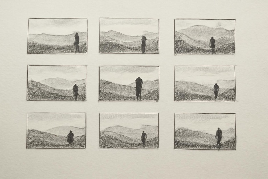
- Create a 3×3 grid of quick colour thumbnails using only three colours per thumbnail.
- Pick one thumbnail and run the five passes described above, keeping each pass visible as a separate layer or saved state.
- Compare how the chosen focal point behaved under different global shifts and note which pass produced the clearest read.
Iterative colour work reduces anxiety around making the “perfect” palette on the first try. By separating experiments—local mapping, global shifts, accent placement—you keep control and discover combinations that support the image’s structure and mood.